
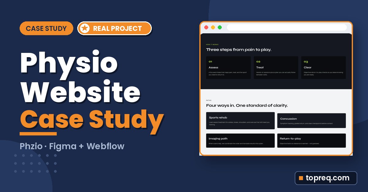
Short answer: Good physiotherapy website design makes one path obvious: from “I’m hurt” to “I’ve booked.” On Phzio, a sports injury care website I designed in Figma and built in Webflow, that meant a homepage that explains care in three steps, a separate Care page that lays out every care path, and one “Book a slot” action that every page leads to. Below is what I built, what worked, and what I would fix next time.
This is a case study of my physiotherapy website design work on Phzio, with real screenshots of the live site at phzio.webflow.io. I’m Hamza, and I design websites in Figma and build them in Webflow. I won’t repeat my full build process here, because I already wrote that up in my Figma to Webflow workflow. This post is about the decisions that were specific to a clinic website, and the places where the first version wasn’t perfect.
What Phzio Is and What the Website Needed to Do
Phzio is a sports injury care brand for athletes. The website had to feel energetic and premium, explain how care works, and push one clear action: book a slot. A person in pain wants to know fast: can you help, what will happen, and how do I book?
- Project: Phzio, a sports injury care and physiotherapy website
- My role: UI design in Figma and development in Webflow
- Live pages: Home and Care
- Live site: phzio.webflow.io
- Type: Syne for headings, Manrope for body text
- Colour: a dark base, white text and one bright lime accent
- Screens: desktop, tablet and mobile, using Webflow’s standard breakpoints

The Physiotherapy Website Design Decisions That Mattered
One action, repeated everywhere
On the homepage, every booking button points to the same place: the Care page, where visitors pick their path. “Book a slot” sits in the navbar and the hero, “Book a consult” appears halfway down the page, and a full-width lime band at the bottom asks “Ready to get cleared?” with the same button. One action, one destination, repeated wherever someone might be ready.
Explain the process before asking for the booking
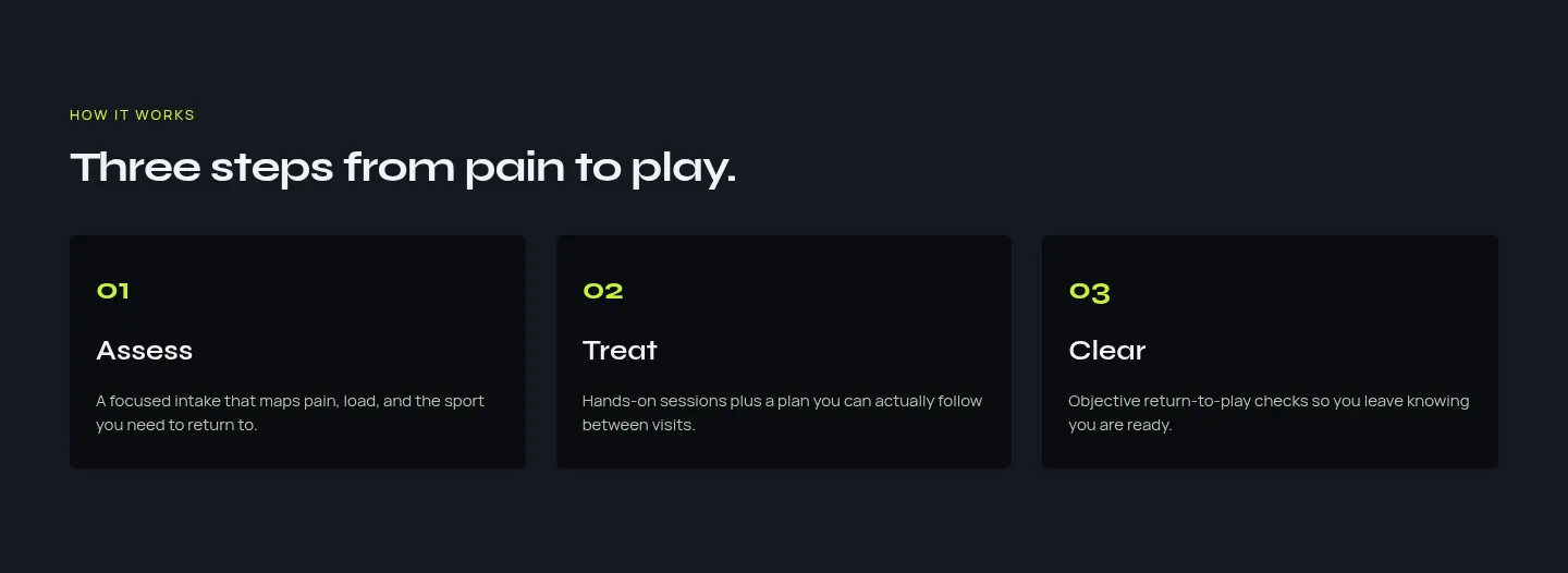
A lot of clinic websites list services and stop there. On Phzio, the homepage has a “How it works” section with three steps: Assess, Treat and Clear. Each step gets one short sentence. It answers the quiet question most patients have before booking: “What will happen when I walk in?”
Speak to specific people
Instead of a generic “we treat everyone” line, the “Who it’s for” section names three groups: club athletes, weekend warriors and youth programs. Each gets a line written for them, like keeping coaches and parents in the loop for youth players. It helps visitors see themselves on the page.
A dark base with one bright accent
The whole site alternates between dark sections and light grey ones, and uses a single lime colour for buttons, numbers and small highlights. That made the important things easy to spot: if it’s lime, you can click it or it matters. Syne gives the headings a bold, sporty shape, and Manrope keeps body text easy to read at small sizes.
Answer objections in a short FAQ
Right before the final call to action, the homepage has four questions: do I need a referral, how fast can I get in, is this only for pros, and what happens after clearance. These doubts stop people from booking, so they come right before the last button.
The Care Page: Turning Services Into Paths
The second page, Care, does the heavy explaining so the homepage can stay short. It’s built around the idea of “paths” rather than a list of treatments:
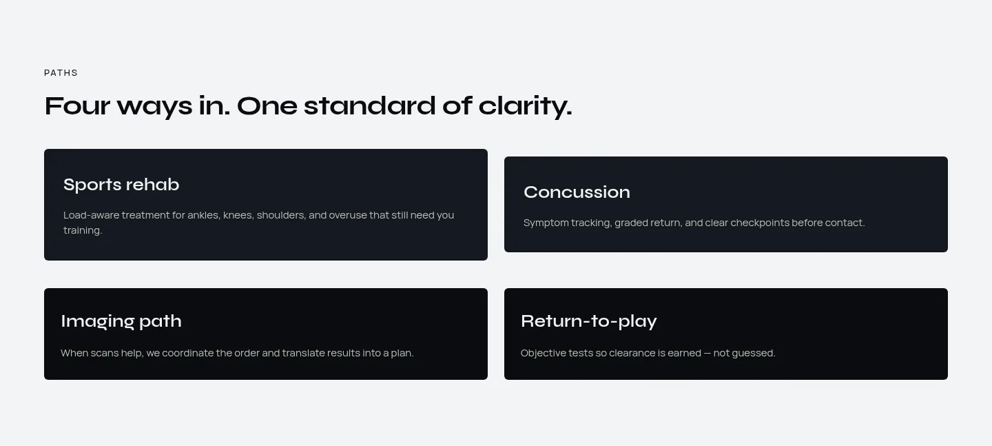
- Four ways in: sports rehab, concussion, imaging path and return-to-play, each with one line on who it suits.
- First visit: intake, assessment and plan, so there are no surprises at the first appointment.
- What we treat: a six-card grid covering knees and ACL, ankles and feet, shoulders, hamstrings, back and hips, and concussion.
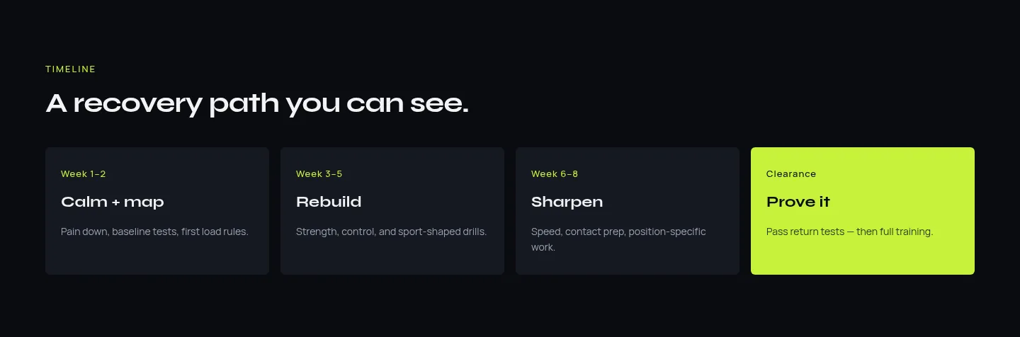
- A recovery timeline: from the first weeks through rebuilding and sharpening to clearance, with the clearance card highlighted in lime.
- One clinician, one plan: a section about working with one dedicated clinician, followed by its own FAQ and a final “Start with the right path” button.
Splitting the content this way kept both pages focused. If you’re planning a site for any service business, my guide on what pages a small business website should have covers how to decide what goes on its own page.
Building It in Webflow
A few build choices worked well on this project:
- One prefix for every class. Every custom class on the site starts with
pz-, for examplepz-section-ink,pz-section-chalkandpz-cta-band. It keeps the project’s styles grouped together and easy to find in Webflow’s style panel. - Reusable section styles. The dark, light and panel section styles are shared across both pages, so the Care page was mostly assembled from styles that already existed on the homepage.
- Small, careful animations. Content fades up a little as you scroll, and buttons grow slightly on hover. A short script handles the scroll reveal, and it switches the animation off for visitors whose device is set to reduce motion.
- Tablet and mobile styles. The layout has its own styles for Webflow’s standard tablet and mobile breakpoints.
What Didn’t Work (and What I’d Fix)
Two things stood out when I reviewed the live site:
The service strip on mobile
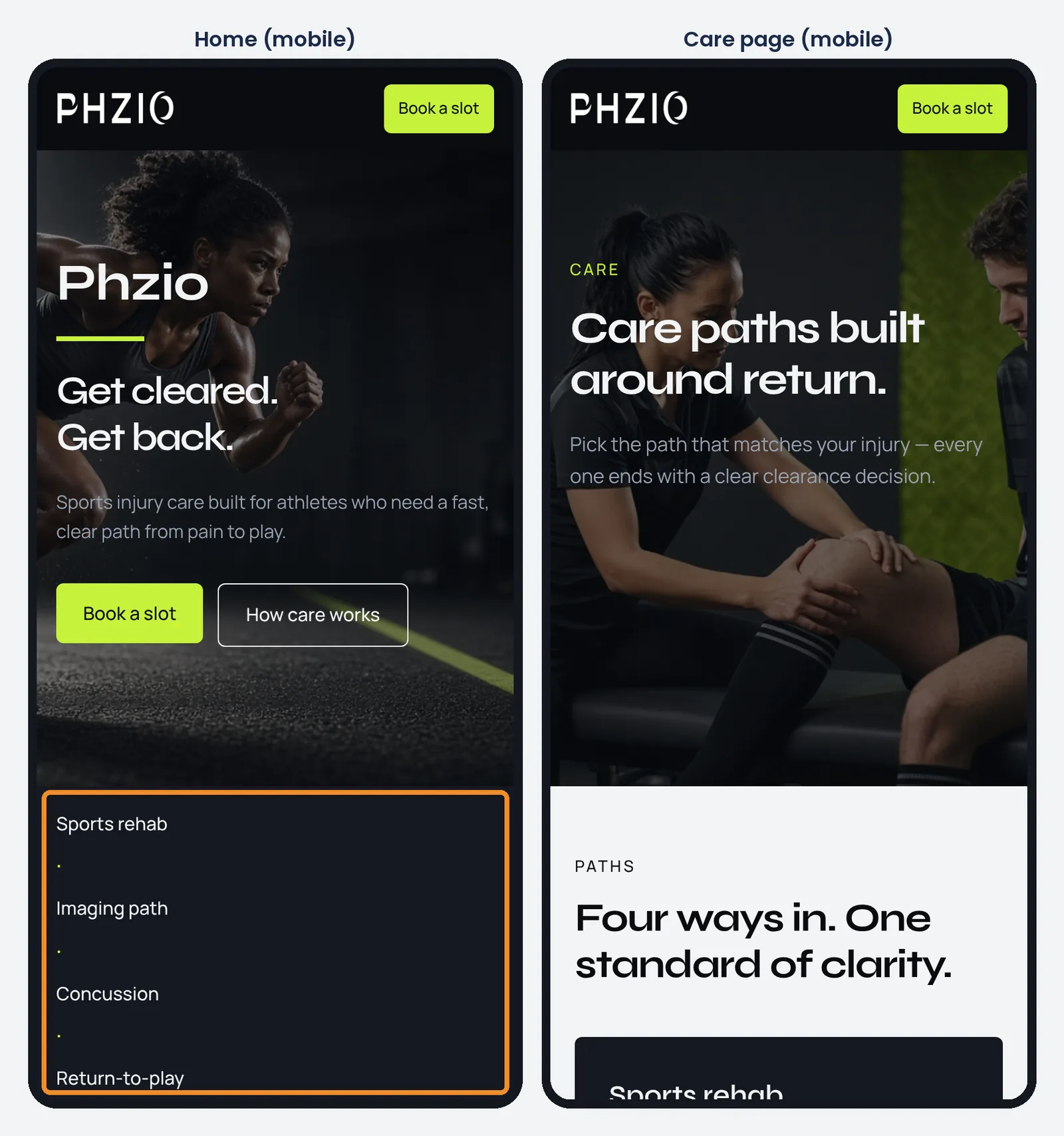
On desktop, a thin strip under the hero lists five care types in one row, separated by small dots. On mobile, the items stack into a list and the separator dots end up on their own lines, which looks like stray marks. The fix is small: hide the separators below the tablet breakpoint, or turn the strip into a two-column grid on phones. Small decorative details deserve a check on a real phone too.
Scroll animations and full-page screenshots
Because content fades in only when it scrolls into view, my first full-page screenshots for my portfolio showed the “How it works” section as an empty dark block. Visitors scrolling the page see everything, but screenshot tools, previews and some testing tools don’t scroll like a person does. Now I check every page with a full-page capture before calling it done, and next time I’d add a fallback so content shows even if the animation never runs.
The Other Half of Phzio: A Program Page Designed in Figma
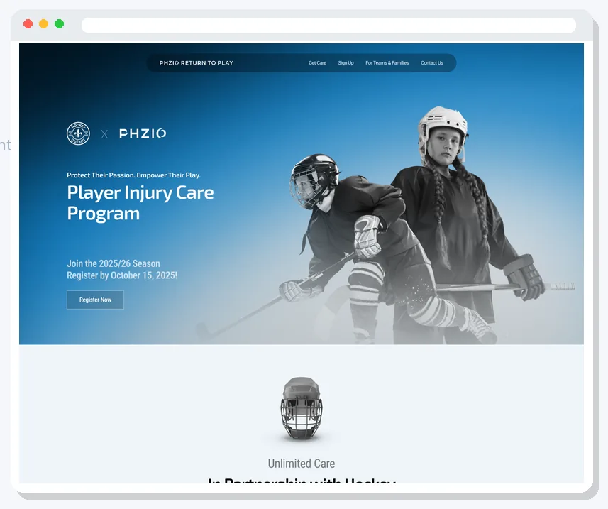
Phzio also had a separate design in my Figma files: a “Return to Play” program landing page, titled “Player Injury Care Program” and co-branded with Hockey Québec. It was designed in both English and French, and I wrote a section-by-section Webflow build spec for it. These screenshots are from the Figma design, not from the live site above.
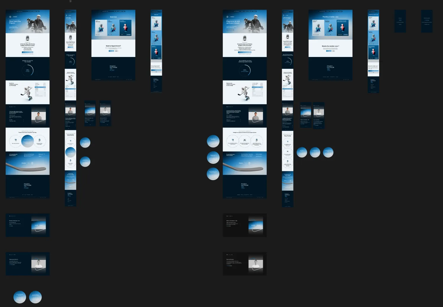
The Figma canvas had 28 top-level frames: four real pages (a landing page and a Book Care page, each in English and French), a mobile version of each, and 20 frames showing interaction states such as step tabs, hover states on three large circles, and the mobile menu opened.
What I learned from this one:
- Drawing interaction states saves arguments later. Because every tab and hover state existed as its own frame, nobody had to guess what “active” should look like.
- Design at least one tablet frame for complex sections. There were no tablet frames, so I had to plan the tablet layout myself in the build spec.
- Do a copy check before the build starts. While writing the spec I flagged a few copy issues, including a typo, a price written in the wrong currency format, and a registration deadline from a past season. Fixing words in Figma is cheaper than after launch.
- Don’t rely on automatic extraction on a free plan. I tried pulling the specs out of Figma automatically through an AI tool connected to Figma, but the free Starter plan hit its monthly limit partway through. I confirmed the fonts (Exo 2, Roboto and Roboto Condensed) by hand in Figma’s Inspect panel instead.
What I’d Do Again on the Next Clinic Website
- One booking action, repeated wherever someone might be ready.
- The care process explained in three simple steps before the first big button.
- Services presented as paths that match the visitor’s injury, not as a long menu.
- A short FAQ placed right before the final call to action.
- One accent colour that always means “this is important”.
- Animations that stay small and respect the reduced motion setting.
And one more thing: for a real clinic, the website is only half the job. Patients often search for something like “physio near me”, so the clinic also needs strong local search basics. My local SEO checklist for small businesses is a good place to start once the site is live.
FAQ
What should a physiotherapy website include?
At minimum: a clear headline about who you help, how your care process works, the conditions you treat, an FAQ that answers booking doubts, and one obvious way to book. Phzio covers these across two pages, Home and Care.
Is Webflow a good choice for a physiotherapy clinic website?
It’s a strong choice if you want a custom design, fast pages and low maintenance, and you’re happy to have it built professionally. If you want to compare it with other platforms, see Webflow vs WordPress vs Wix.
Should a clinic website use animations?
Small ones, yes. Gentle fade-ins and hover states make a site feel polished. Big, slow animations get in the way of someone who just wants to book, and they should always switch off for visitors who turn on reduced motion.
Want a Website Like This for Your Business?
I run The Boostology, where we handle website design and development for small businesses, with Webflow development as our specialty. We also write blog content for businesses that want their articles done for them, the same kind of practical posts you read here on TopReq.
If you have a clinic, a service business or a Figma file that needs to become a real website, book a free 30-minute call, visit theboostology.com, or email info@theboostology.com. Tell me what you have, and I’ll tell you honestly what it needs.
Need help growing your business online? TopReq is run by the team at Boostology, a web design and digital marketing agency.
Services: Website Design, SEO, Social Media Management, Meta Ads.