
Short answer: Ellaj is a thalassemia organisation website I designed in Figma and built in Webflow. What I’d do again: a split hero that stacks cleanly on mobile, one warm coral colour used with discipline, a four-card values grid, and a News section that runs on a Webflow CMS collection with simple filters and search. What I’d change: less Title Case text, and a clear plan for what happens after someone joins the newsletter. This Figma to Webflow case study walks through each part with screenshots from the live site.
Disclosure: This article contains one affiliate link (Systeme.io). If you sign up through it, TopReq may earn a small commission at no extra cost to you. We only recommend tools we have used or researched.
This Figma to Webflow case study covers Ellaj, a website you can see live at ellaj.webflow.io. I’m Hamza, and I design websites in Figma and build them in Webflow. My step-by-step process (file prep, handoff, class naming, QA) is already in my Figma to Webflow workflow, so this post skips the general process and focuses on Ellaj: what each section does, what worked, and what I’d do differently.
What Ellaj Is and What the Site Had to Do
Ellaj is an organisation working on thalassemia prevention and patient support. The website needed to present its mission, programs, news and contact options in a layout that feels warm and trustworthy, and that is easy for families and partners to find their way around. The name means “treatment” in Urdu, and the logo carries the word in Urdu script inside a coral circle.
- My role: UI design in Figma and development in Webflow
- Live pages: a one-page homepage, a News page, and a page for each news story
- Live site: ellaj.webflow.io
- Type: Kanit, used across headings and body text
- Colour: a warm coral accent, a deep maroon for one contrast section, and plenty of white space
The Homepage, Section by Section
The homepage is one scrolling page. The menu items Project, About, Ellaj and Contact jump to sections on that page, and News opens its own page.
A split hero
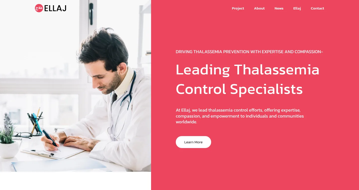
The hero is split in two: a photo on the left and a solid coral block on the right with a short eyebrow line, the headline “Leading Thalassemia Control Specialists”, one sentence about Ellaj’s mission and a Learn More button. I decided how it would stack while still in Figma: on a phone, the photo sits on top and the coral block follows underneath, so the headline is still on the first screen.
Initiatives with a photo collage
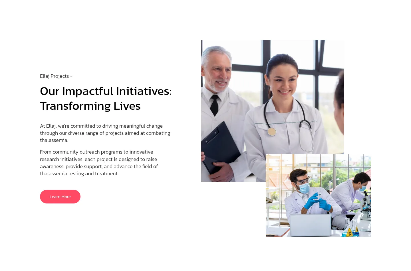
The next section, “Our Impactful Initiatives: Transforming Lives”, pairs two short paragraphs with two overlapping photos. The overlap adds a bit of depth without needing any animation, and it breaks up the straight lines of the hero.
Partners, then one dark section to slow down
A simple row of partner logos sits under the initiatives. After that comes the only dark section on the page: “Thalassemia Solutions”, in deep maroon with a thin line illustration of laboratory equipment. Putting one dark block in the middle of a light page acts like a pause. It tells the reader that this part is the core message.
Four values as cards
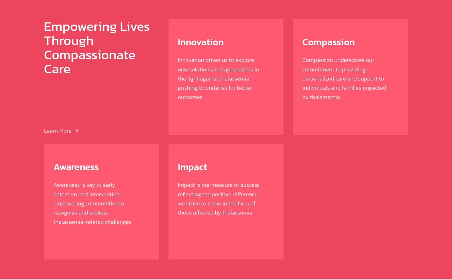
“Empowering Lives Through Compassionate Care” introduces four values: Innovation, Compassion, Awareness and Impact. Each one gets a card with a title and a short paragraph. Cards were the right call here because the four values are equal. A list would suggest an order, and long paragraphs would bury them.
A quote, the latest news, and the footer
The page closes with a large quote block, the three latest news stories as cards, and a footer with navigation columns, contact details and a “Stay up to date” newsletter form. The email and phone in the footer are proper links, so on a phone one tap starts an email or a call.

The News Section: Where Webflow CMS Earns Its Keep
The News page is where the build goes beyond static design. The stories live in a Webflow CMS collection. The page shows a featured story at the top, then filter buttons (All, Project news, Partner news), a search field, and a grid of story cards with category and date. Each story has its own page, generated from one CMS template.
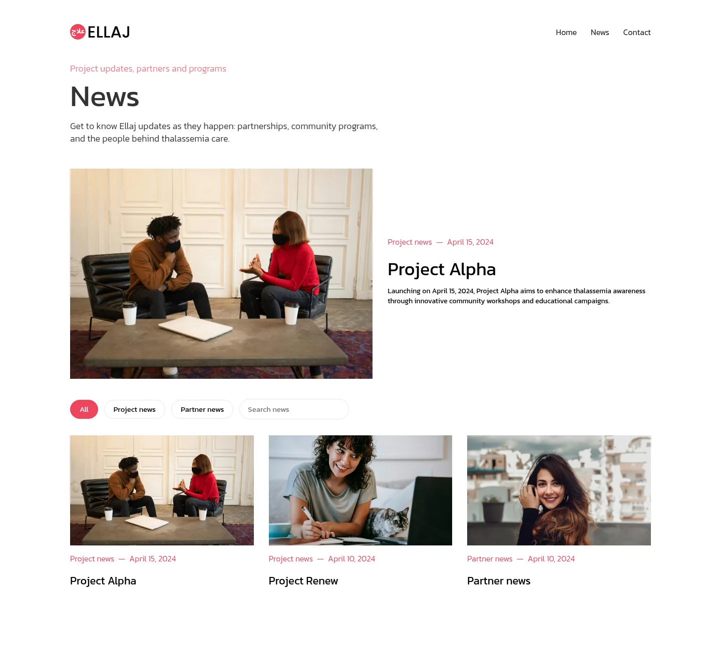
For the filters and search I used a small custom script on the page, with no extra library. For a handful of stories that’s plenty. If a collection grows large or needs more complex filtering, Finsweet Attributes is a popular no-code option for CMS filtering and search in Webflow.
The real benefit is for the people running the site. To publish a new update, they add an item to the collection, and it shows up on the News page and in the homepage news cards without anyone touching the design.
Mobile: Designed, Not Just Squeezed
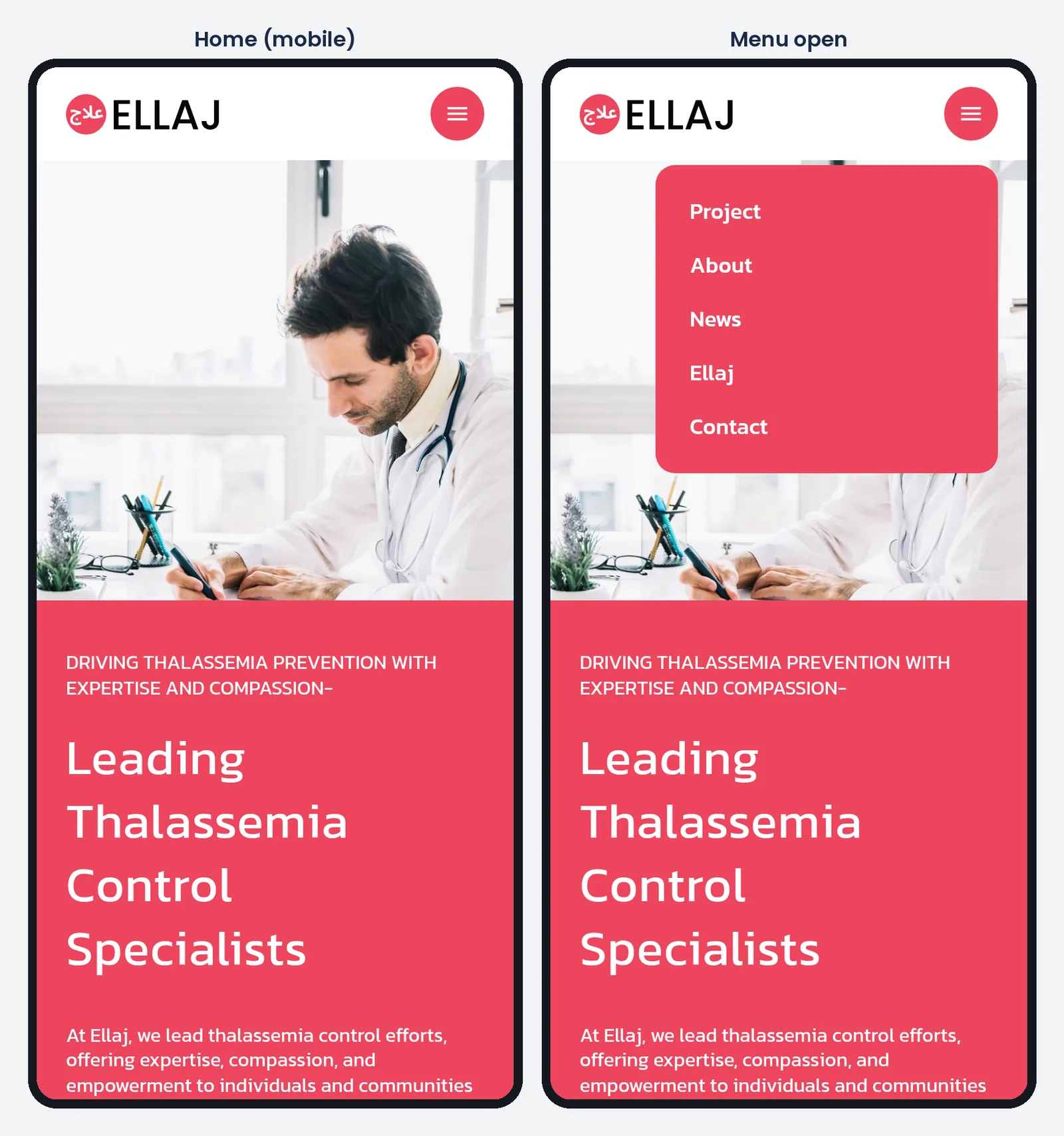
On phones, the navigation collapses into a round coral menu button. Tapping it opens the links in a coral dropdown card that matches the rest of the brand, instead of a plain grey default menu. The hero stacks as planned, and the cards drop into a single column.
Lessons From This Figma to Webflow Case Study: What I’d Do Again
- Decide how the hero stacks on mobile in Figma, before building anything.
- Pick one accent colour and use it for every button and highlight.
- Use one dark section as a deliberate pause in a light page.
- Use cards when items are equal, and lists when they have an order.
- Put anything that repeats, like news, into a CMS collection from day one.
- Keep the menu on mobile on-brand, not left as a default.
What I’d Change Next Time
Go easy on Title Case
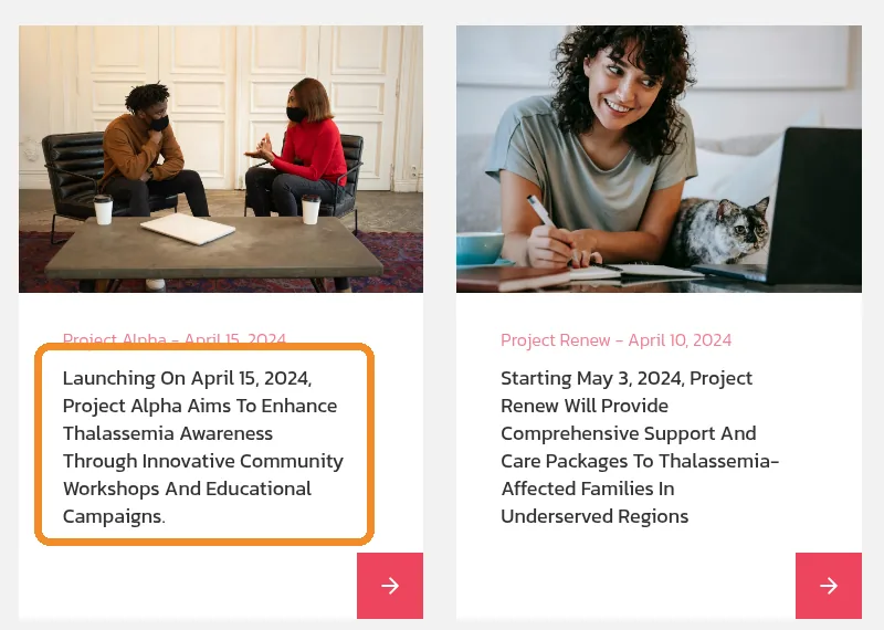
Several text styles on the homepage, including the news card text, are set to capitalise every word. It looks fine on short headings and buttons. On a full sentence, it slows reading down, and it makes the cards look different from the News page, which uses normal sentence case. Next time I’d keep Title Case for short labels only and leave sentences in sentence case.
Plan what happens after the newsletter signup
The footer form is a native Webflow form with proper success and error messages, and it collects email addresses well. But a Webflow form only collects them. It doesn’t send a newsletter. If an organisation actually wants to email its subscribers, it needs an email tool connected to that form, such as Systeme.io, which handles email lists, newsletters and simple automations. Next time I’d settle that before launch, so the first subscribers get a welcome email instead of silence.
Tools I Used (and One I Keep for Other Work)
Ellaj was designed in Figma and built in Webflow, which also runs the CMS and the hosting. If you’re still deciding which platform to build on, I compared the main options in Webflow vs WordPress vs Wix.
Canva wasn’t part of this build, but I use it for a different kind of design: printable templates. One of them is a Something Blue bridal shower invitation template on Etsy. Different tool, same rule as Ellaj: design for how people will actually use it.
FAQ
Can you turn a Figma design into a Webflow site automatically?
Only partly. Webflow’s Figma plugin can bring over auto layout frames, styles and variables, but interactions, CMS and responsive fine-tuning still need hands-on work in Webflow. A clean Figma file matters more than any plugin.
Do I need Webflow CMS for a news or blog section?
If you plan to post updates regularly, yes. A CMS collection lets you add a story without editing the design, and every story gets its own page from one template, which is how Ellaj’s News section works.
How do you add filters and search to a Webflow collection?
For a small collection, a short custom script is enough, which is what Ellaj uses. For bigger collections, a no-code option like Finsweet Attributes is worth a look.
How much does a website like this cost?
It depends on page count, CMS needs and how much content has to be written. I broke down the typical ranges in how much a small business website costs.
Need a Website or Blog Content for Your Business?
The Boostology handles website design and development for businesses and organisations, with Webflow development as our specialty. We also write blog content for businesses that want their articles planned and written for them.
If you have a design, a rough idea or an old site that needs a rebuild, book a free 30-minute call, visit theboostology.com, or email info@theboostology.com.
Need help growing your business online? TopReq is run by the team at Boostology, a web design and digital marketing agency.
Services: Website Design, SEO, Social Media Management, Meta Ads.